26. March 2021 By Viktoria Düngfelder
User interface design – design basics for non-designers
UI (user interface) design refers to the design of user interfaces that act as a broker between human input and machine actions. UI design is a sub-discipline of UX (user experience) design.
Visual design is a profession in itself and requires an understanding of aesthetics, functionality and human behaviour. In behavioural economics, it is taken for a fact that human beings do not always act as rational individuals. Unconscious, multisensory processing influences our purchasing decisions. People often judge and make decisions on an emotional level.
Even if an application is technically ingenious, it takes a professional design to add value to the product and enhance its perceived quality. It is what makes an app stand out from the crowd.
Design differs from art in one key respect: It must have a purpose. A good UI design supports usability. Just because something looks good does not mean that the design is good. Design is the discipline of solving problems in an attractive way, thus making app functions intuitive and exciting. Like any other discipline, it relies on fundamentals and rules to achieve a consistent look and feel. If you know these rules and implement them, you can achieve surprisingly good results – even without an intuitive sense of aesthetics and balance.
Visually appealing products are perceived as more user friendly, and their attractiveness has a great impact on how products are used. These products are more effective in forming positive attitudes, and at the same time they make users more forgiving of and patient towards usability weaknesses.
Design guide
Beauty is always subjective; it depends on the cultural background, knowledge and experience – and even the timing and environment can influence a person’s perception. Nevertheless, there seem to be certain things that apply equally to everyone, for example, as regards symmetry.
Design laws – clarification of relationships
The laws of design are based on empirical research into human perception and its ability to process sensory impressions and thus to classify and reduce patterns, principles of order, structures and complex scenarios. Our brain prefers the interpretation that causes the least cognitive effort.
Even in the virtual sphere, we prefer familiar patterns and expect to find common interface elements at a certain position in the layout. Interface designers need to know user expectations in order to make the right decisions.
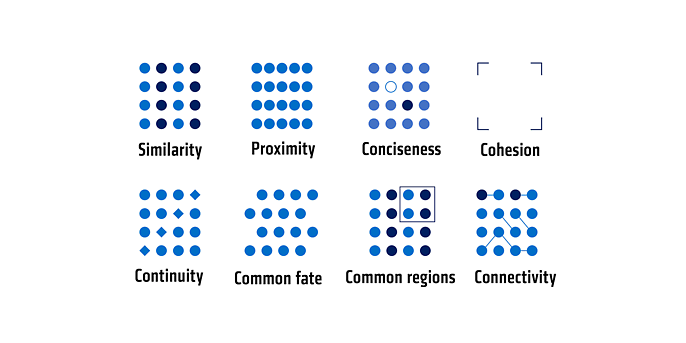
Consideration of the following fundamentals makes it possible to prepare the information to be presented in such a way that users can absorb and process it completely, without errors or fatigue. It should be noted that the fundamental laws of perception cannot be cleanly separated as they are interdependent.
- Law of similarity: We are more likely to recognise similar or identical elements as belonging together than dissimilar ones.
- Law of proximity: We perceive elements arranged in close proximity to one other as belonging together.
- Law of conciseness: Central elements that should stand out can be brought into focus by means of a concise design. Essential design elements are colour, size and shape.
- Law of cohesion: Several objects are grouped together as a unit if possible. Our brain automatically fills in the missing lines of known shapes in our mind’s eye.
- Law of continuity: The law of continuity describes the tendency to group individual elements in such a way that lines are extended in the mind such that they continue in the perceived direction.
- Law of common fate: Different elements that move in the same direction or in the same rhythm are perceived as a group of common elements.
- Law of common regions: We perceive elements in delimited areas as belonging together.
- Law of connectivity: Forms that are connected to each other are perceived as a unit.

White space – balancing simplicity and complexity
White space isn’t just there doing nothing. And it’s not wasted space. It can be used effectively to create hierarchy and order. As such, it is essentially another design tool. The trick is to find the perfect balance between simplicity and complexity.
There are two types of white space: macro and micro. The macro white space defines the space between the main elements of a composition. Micro white space, on the other hand, refers to the distances of other elements to each other, such as the space between lists and their elements.
Our brain associates white space around an element with importance, so viewers react more strongly to such elements. Our eyes lock onto objects in an area that separates them from other objects, so our attention is drawn to the essential elements. This is where the law of proximity comes into play as mentioned in the previous paragraph.
Don’t make me think: Users are not lazy. Well, maybe a little – sometimes. But first and foremost, it’s about making the cognitive load that an interface design creates as fun and user friendly as possible. After all, users have a lot of other things on their minds anyway, and squeezing in extra information only makes it harder for them to get their tasks done.
Balance – creating harmony through symmetry and asymmetry
Visual balance is the principle that makes a design appear evenly weighted.
Symmetrical design creates balance through evenly balanced elements arranged along a central line. Asymmetrical design uses opposing weights – such as one large element that stands out among several smaller elements. The purpose of this is to create a composition that, while not being unified, still carries a sense of balance.
There is also radial balance, e.g., when visual elements spread out from a common centre, and mosaic balance. The latter refers to an ‘organised chaos’ that actually creates balance through the absence of a specific centre. Each element shares a common focus, and no single element dominates the composition.
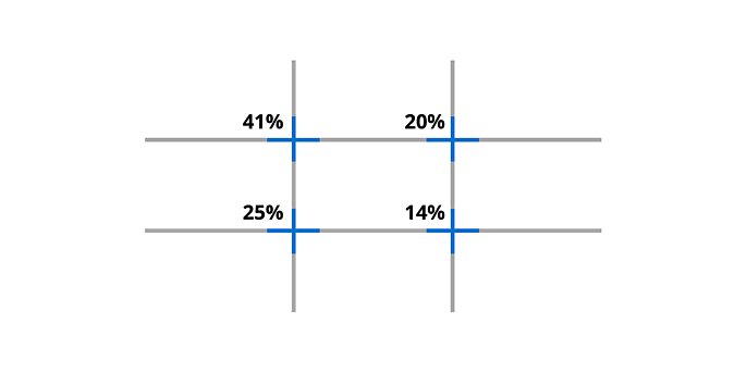
If you’re having trouble finding balance in your design, use the rule of thirds as a guiding principle. It is a basic rule that works simply and effectively. Divide your design into three rows and three columns. The points where the vertical and horizontal lines meet are the sweet spots. These are perfect for placing the key object and its supporting elements.
Studies show that each item in the subdivisions is given varying degrees of attention. The main focus is on the upper left point and then moves to the lower right with ever less attention.

Colour – creating and directing attention
Which colours are used, which purposes do these colours serve and to what degree are they used? Colour helps us to identify the meaning of information more quickly. It also serves to convey a psychological effect and plays a major role in the design of icons such as icon buttons or links. It indicates which elements are interactive, how they relate to other elements and how clearly they stand apart.
Designing in grayscale initially simplifies the most complex visual design issues and forces you to focus on spacing, sizing and layout first. This reduction can help arrange the product in an appealing and user-friendly way – without the help of colour. Add colours at the very end, and even then only if they serve a specific purpose.
Conclusion
‘Good design is actually a lot harder to notice than poor design, in part because good designs fit our needs so well that the design is invisible.’ - Donald A. Norman
There is nothing ‘simple’ about innovative design. If you want to design an aesthetically pleasing product, it is important to know the laws of design and to apply them.
If you break the rules, you will end up in design hell.
Well, not literally, of course. But a good user interface applies the rules of design and only breaks them deliberately to create an exciting user interface. If you’re looking for inspiration or want to learn from the pros, check out www.dribbble.com, www.behance.net or www.pttrns.com.
Would you like to learn more about exciting topics from the world of adesso? Then check out our latest blog posts.


